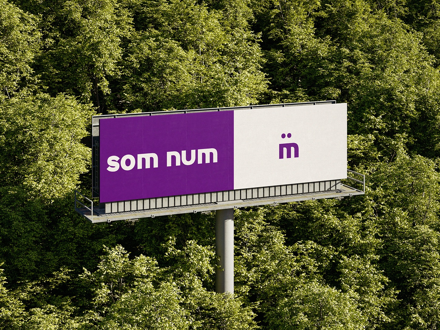
som num
Hey there! We're num, and we're all about embracing the unexpected twists and turns that life throws our way. We understand that sometimes a small mistake can lead to a whole new perspective, and that's what sets us apart. Our mission is to celebrate the uniqueness in every individual, encouraging you to embrace your quirks and imperfections, because that's what makes you truly remarkable.
Design Challenge
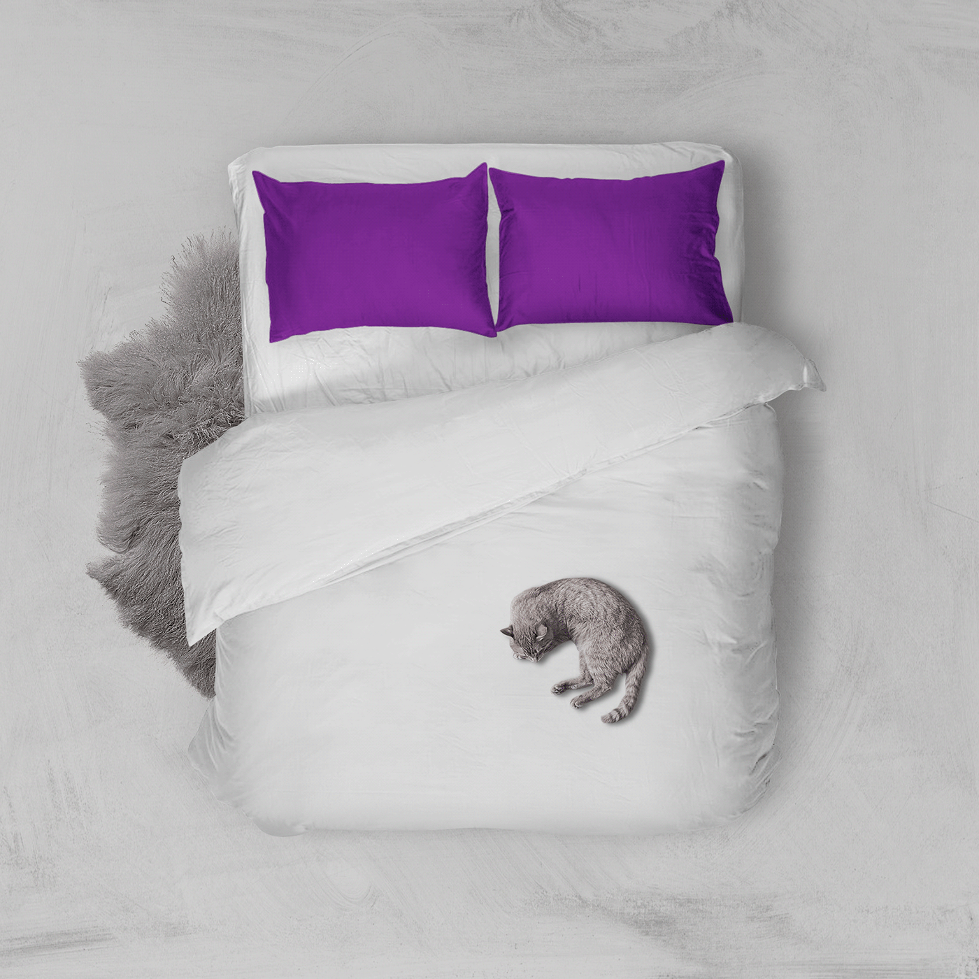
At num, we've crafted a line of innovative products that adapt to your ever-changing needs. Our signature feature is our adaptable mechanism, allowing you to effortlessly customize your experience with just a simple adjustment. Say goodbye to rigid structures and hello to fluid flexibility. With materials designed for breathability and comfort, our products ensure a restful night's sleep, so you can wake up feeling rejuvenated and ready to conquer the day. Plus, our easy-to-clean designs mean maintenance is a breeze, keeping your num product feeling fresh for years to come. Our tone is vibrant, approachable, and resonates with the spirit of adventure and self-discovery.
At num, we've crafted a line of innovative products that adapt to your ever-changing needs. Our signature feature is our adaptable mechanism, allowing you to effortlessly customize your experience with just a simple adjustment. Say goodbye to rigid structures and hello to fluid flexibility. With materials designed for breathability and comfort, our products ensure a restful night's sleep, so you can wake up feeling rejuvenated and ready to conquer the day. Plus, our easy-to-clean designs mean maintenance is a breeze, keeping your num product feeling fresh for years to come. Our tone is vibrant, approachable, and resonates with the spirit of adventure and self-discovery.
The Solution
After extensive research, num discovered a symbol that encapsulates the essence of our brand. The meaning behind the letter 'm' and the fluidity of its strokes represent our commitment to adaptability and embracing change. Just like the letter 'm', our products can transform and evolve to meet your unique preferences. Whether you want to amplify your experience or dial it down a notch, num products empower you to tailor your environment to suit your needs. Our typography is bold and dynamic, complementing the symbol to create a distinctive visual identity that leaves a lasting impression on our audience.
After extensive research, num discovered a symbol that encapsulates the essence of our brand. The meaning behind the letter 'm' and the fluidity of its strokes represent our commitment to adaptability and embracing change. Just like the letter 'm', our products can transform and evolve to meet your unique preferences. Whether you want to amplify your experience or dial it down a notch, num products empower you to tailor your environment to suit your needs. Our typography is bold and dynamic, complementing the symbol to create a distinctive visual identity that leaves a lasting impression on our audience.